I’m a visual designer, illustrator, and all-around design enthusiast. I specialize in branding and identity, creative strategy and wayfinding. Past roles and clients include the University of Virginia, Elon University, Capital One, Indeed, and more.
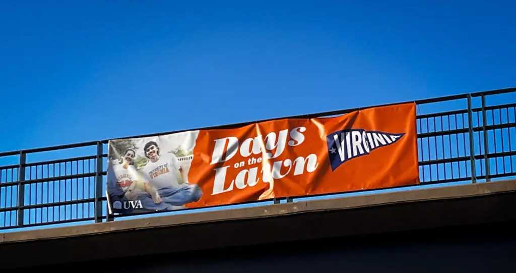
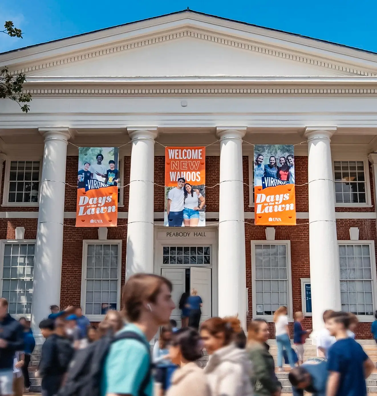
Creating a new visual identity and direction for the University of Virginia’s Days on the Lawn (DOTL), an annual event welcoming newly admitted students and their families to UVA’s historic grounds.
Designing a visual Identity and corresponding signage and materials for Bird Dog Pit BBQ, a contemporary refresh of a storied BBQ institution in Austin, TX.
Designing a visual identity, exterior signage, and corresponding collateral for Bottega, an upscale Italian-inspired cafe and market in Austin’s pedestrian-centric Mueller district.
Branding, Brand Management, Print Collateral, Web Design, and Digital Asset Management
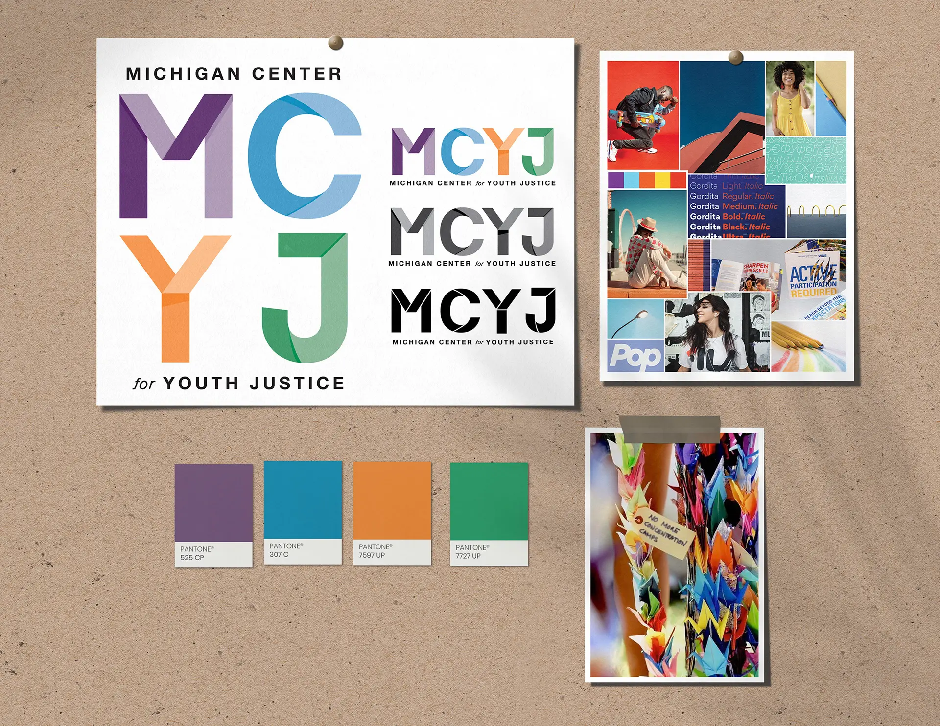
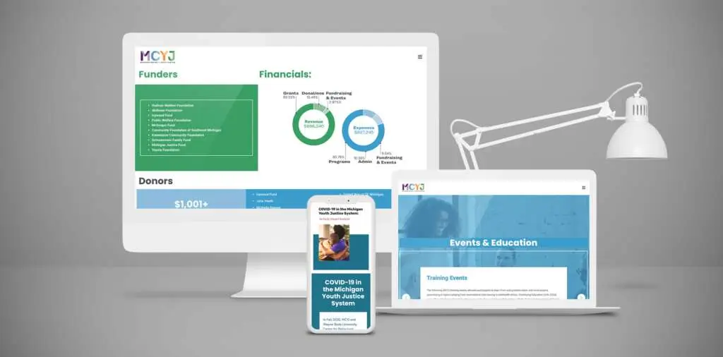
Designing a visual Identity rebrand for the Michigan Center on Youth Justice (MCYJ), formally known as the Michigan Council on Crime and Delinquency (MCCD).
Designing brand identity and corresponding collateral. 2024
Proposition:
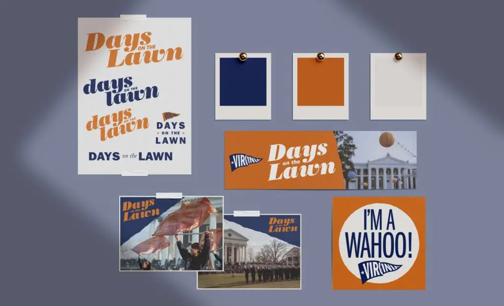
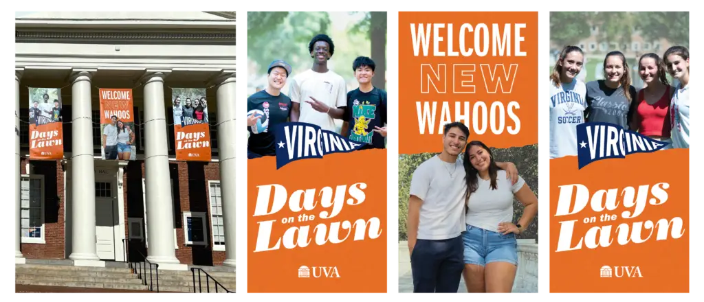
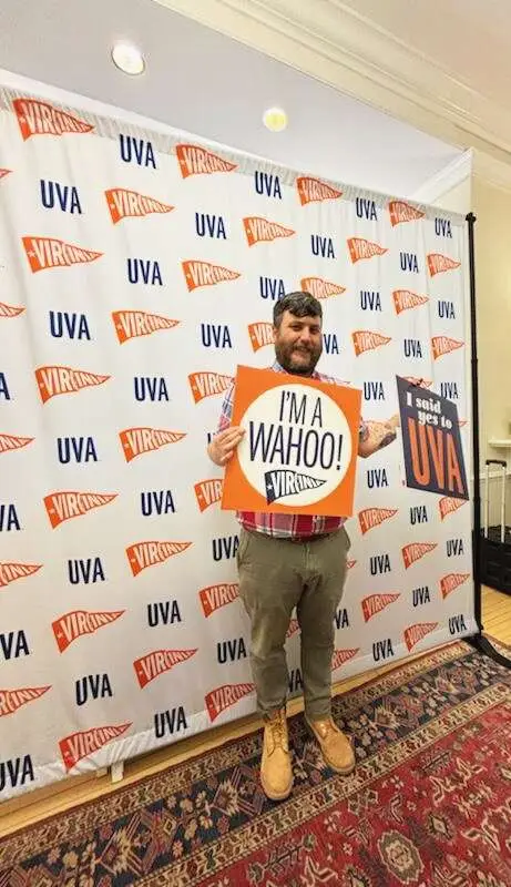
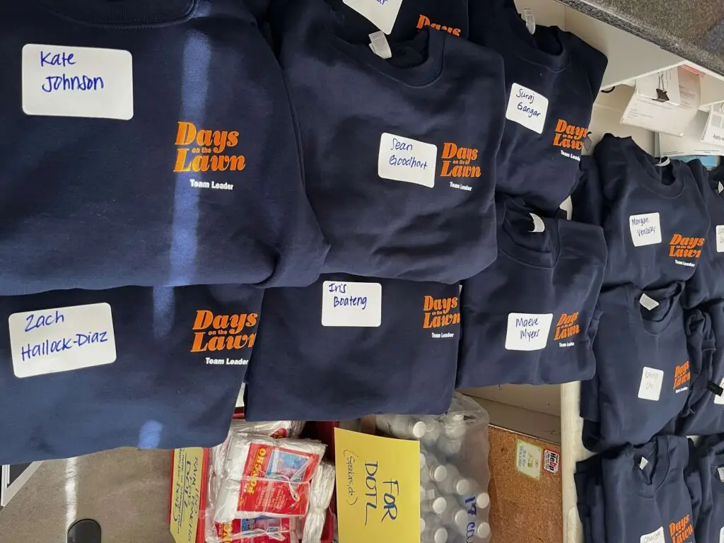
Design an updated visual identity for the University of Virginia’s Days on the Lawn (DOTL), an annual event welcoming newly admitted students and their families to UVA’s historic grounds.
Plan:
Create a warm, energetic subbrand highlighting UVA’s unique attributes. Based on feedback from previous events, I also wanted to ensure DOTL’s assets were recognizable and easily directed DOTL participants to necessary site locations and events.
The Particulars:
I worked closely with Undergraduate Admissions on updating the DOTL brand, ensuring photo selection, color choice, and logo placement leveraged the University’s well-established brand to create something fresh, capturing the energy of a student experiencing UVA for the first time.
To guide students through a full day of activities across UVA grounds, I designed a streamlined and customizable map of Grounds incorporating Facilities Management’s most recent printed map with the Geospatial Engineering Office’s official ArcGIS Virtual Visitors Map. For the banners and additional environmental graphics, I collaborated with University Facilities Management and the Office of the Architect to ensure assets met UVA’s specific regulations for historic buildings and areas.
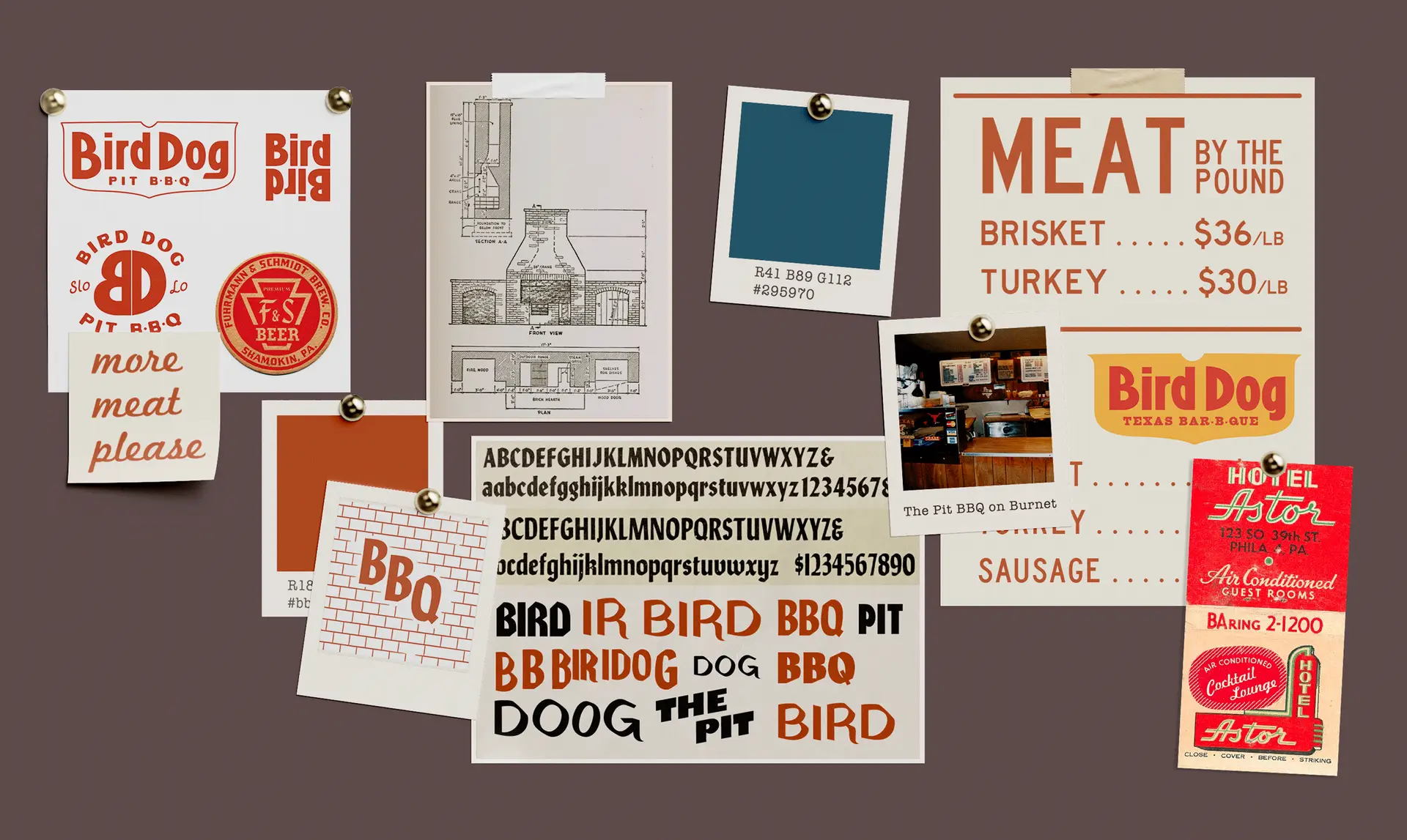
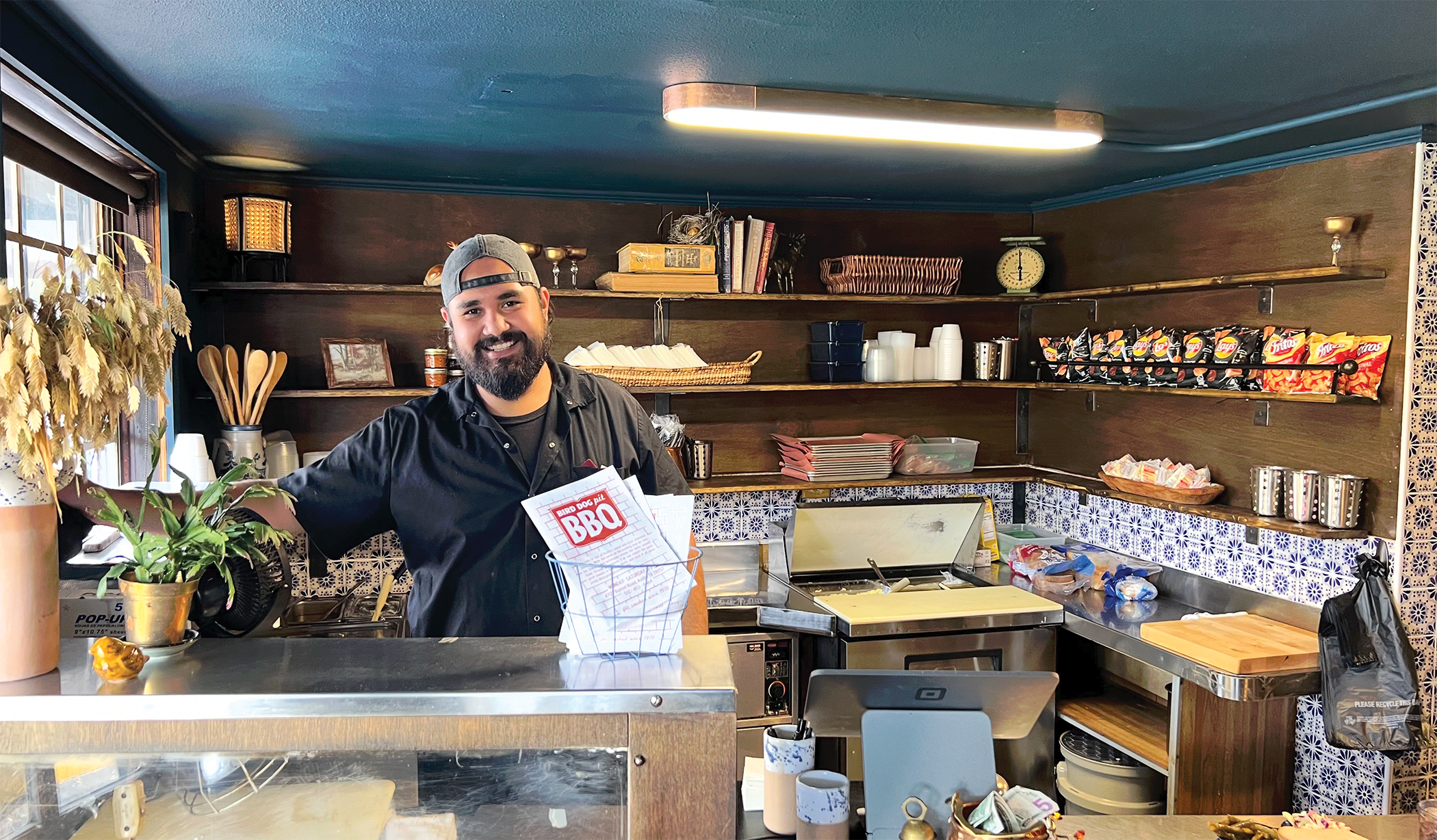
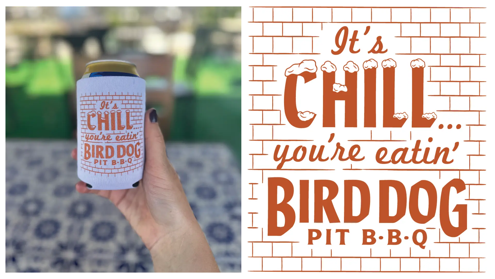
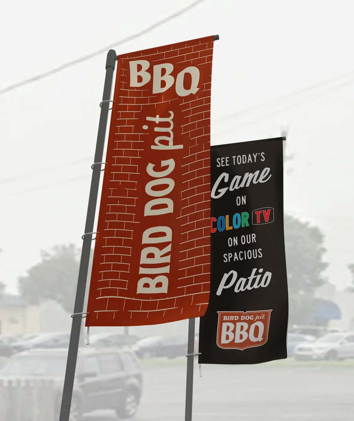
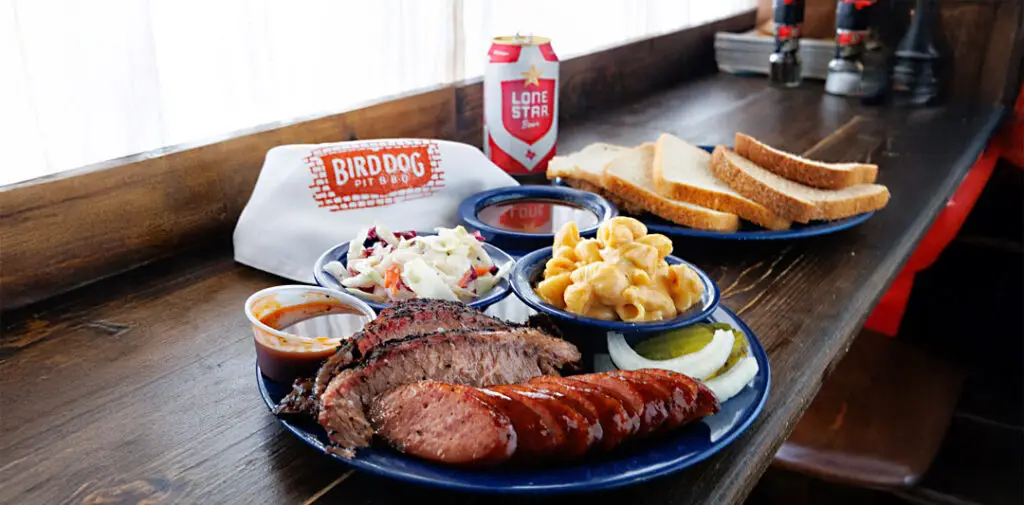
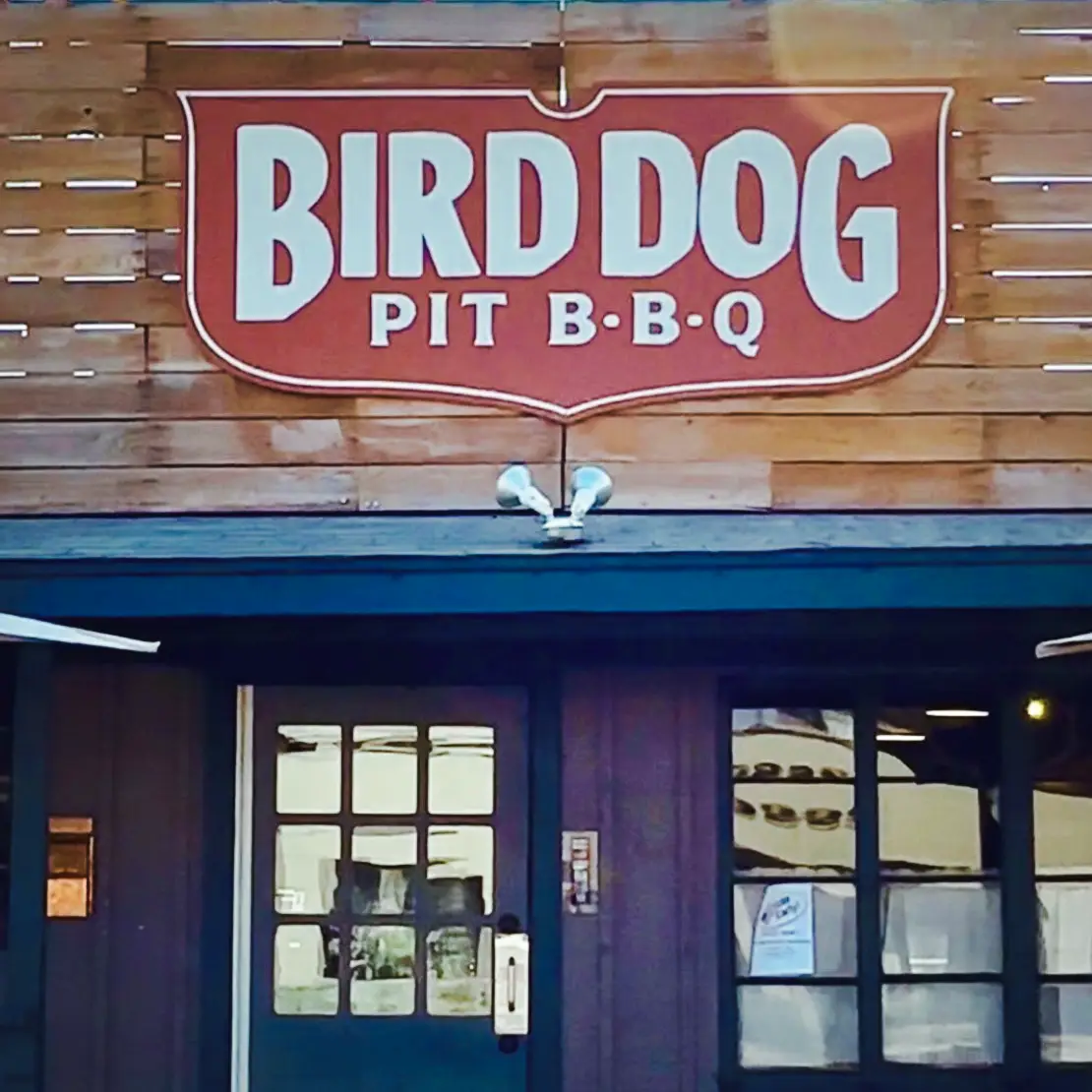
Bird Dog Pit BBQ
Brand identity and visual materials for Bird Dog Pit BBQ 2024
Proposition:
Designing a visual identity for Bird Dog Pit BBQ, a new restaurant opening in a historic Austin pit-BBQ location.
Plan:
Create an identity that feels fresh yet familiar, connecting a refined contemporary take on Texas BBQ to a location that’s been serving traditional style BBQ for over 50 years.
The Particulars:
Bird Dog Pit BBQ is the next chapter for The Pit, an Austin, TX legacy. To help usher in the new name and menu, I found inspiration in Texas’ rich BBQ history but also focused on differentiating Bird Dog’s design from the crowded field of Austin’s retro inspired restaurant scene. By referencing 20th century dining staples like steak houses and supper clubs, I built upon the fine-dining touches and rustic approach of Bird Dog’s new co-owner and Pitmaster, whose hunting dog the restaurant is named after, while also providing a different take on local nostalgia.
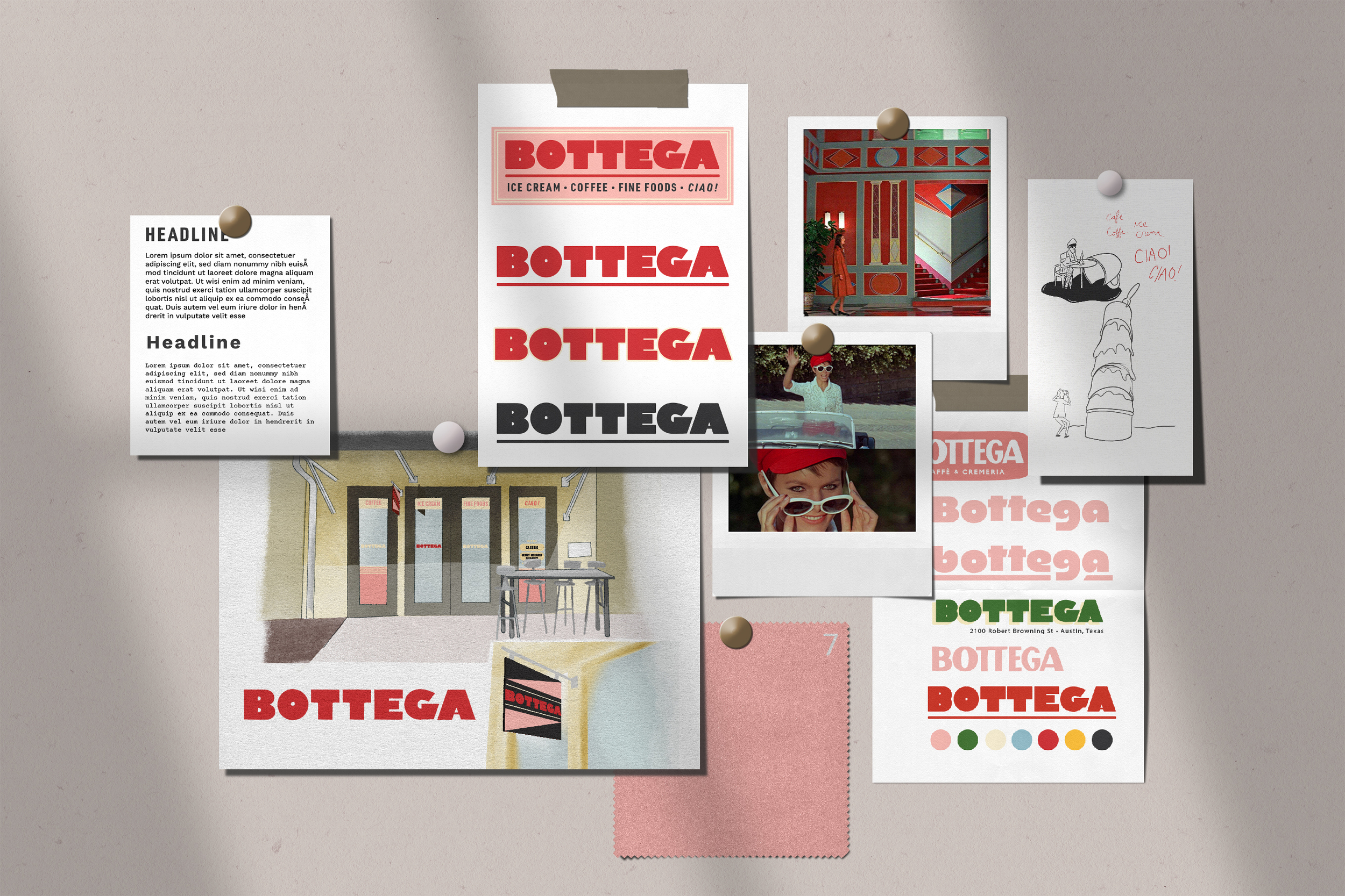
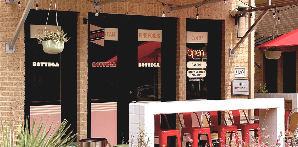
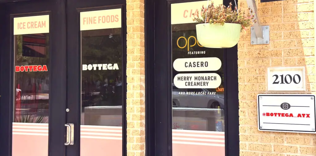
Bottega
Brand identity and visual materials for Bottega Eatery 2023
Proposition:
Designing a visual identity for Bottega, an upscale Italian-inspired cafe and market in Austin’s pedestrian-centric Mueller district.
Plan:
Create something simple, eye-catching, and memorable that instantly channels the recognizable vintage Italian coolness underpinning the Bottega concept. Also, use lots of pink.
The Particulars:
Inspired by vintage Italian style but with an unmistakably contemporary approach to local cuisine, Bottega demanded an identity grounded in classic design and instantly recognizable in a contemporary landscape. I took inspiration from Italian film posters’ use of bold time-honored fonts, starting with Gil Sans Bold and modifying the letter set to be distinctly Bottega’s.
Located in Austin’s Mueller District and bound by a strict code limiting exterior signage, I designed full-window vinyl treatments digitally printed in the brand’s distinct pink and red to turn Bottega’s identity into the perfect backdrop for a cup of coffee paired with an impromptu photo shoot.
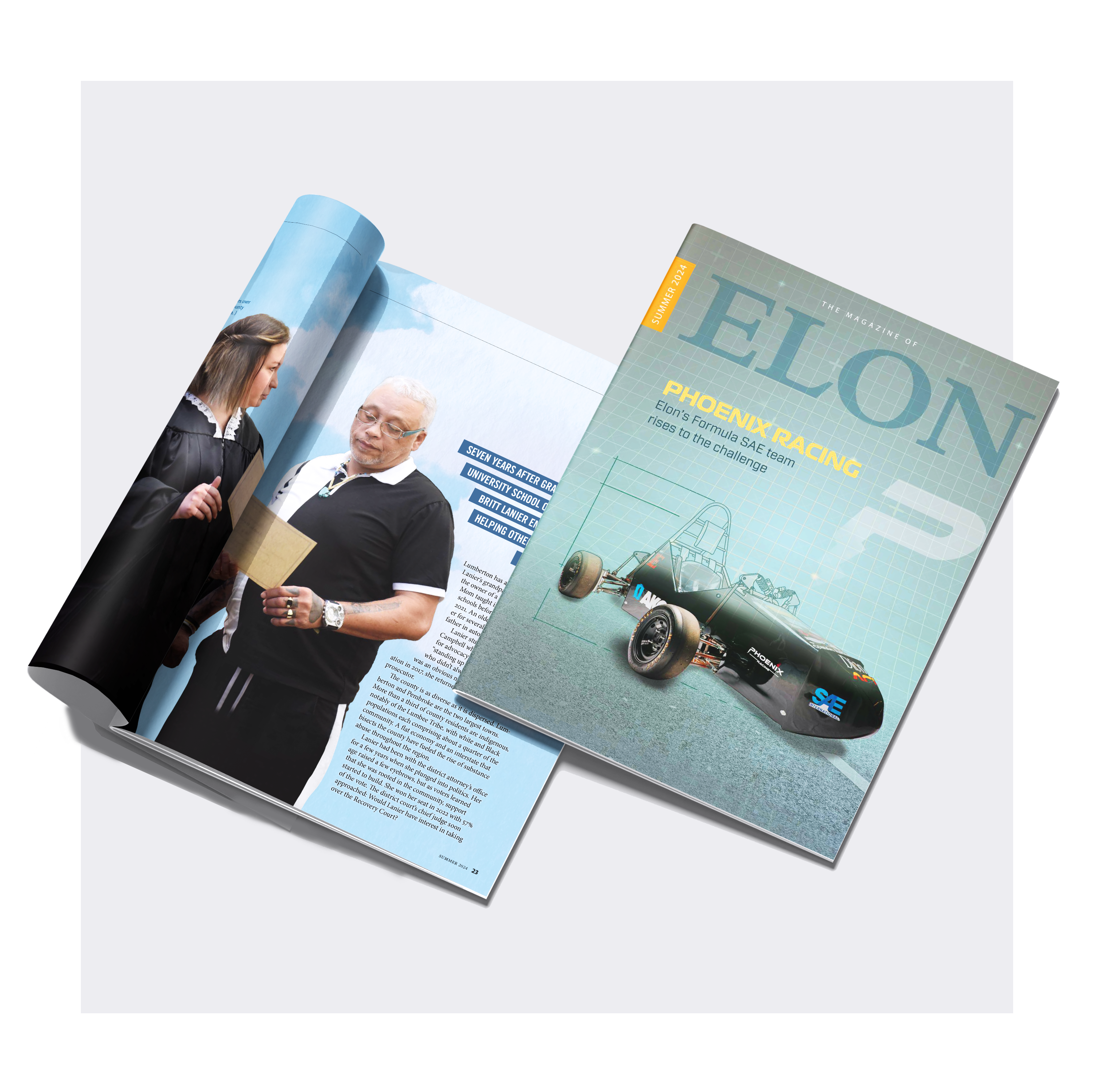
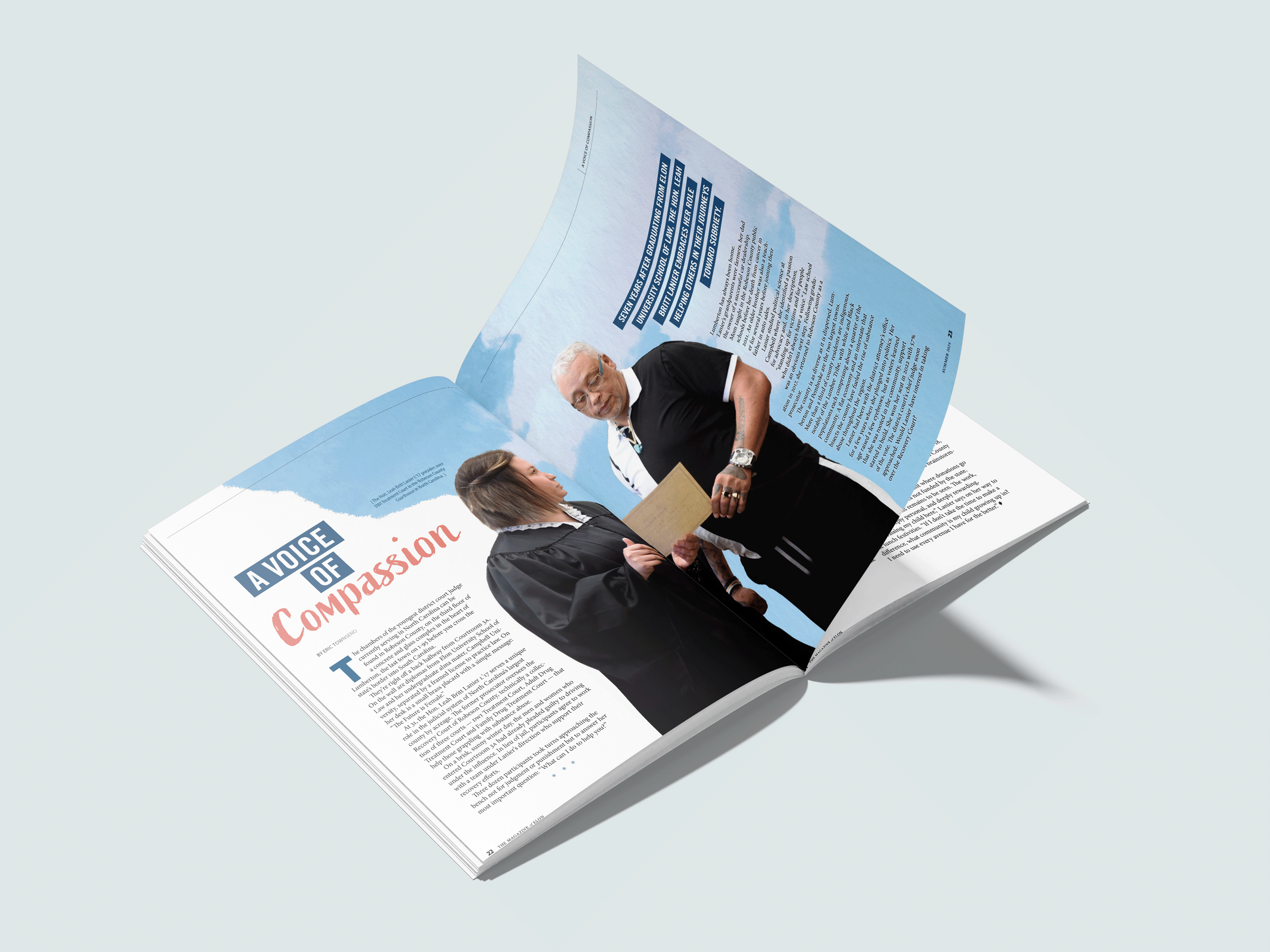
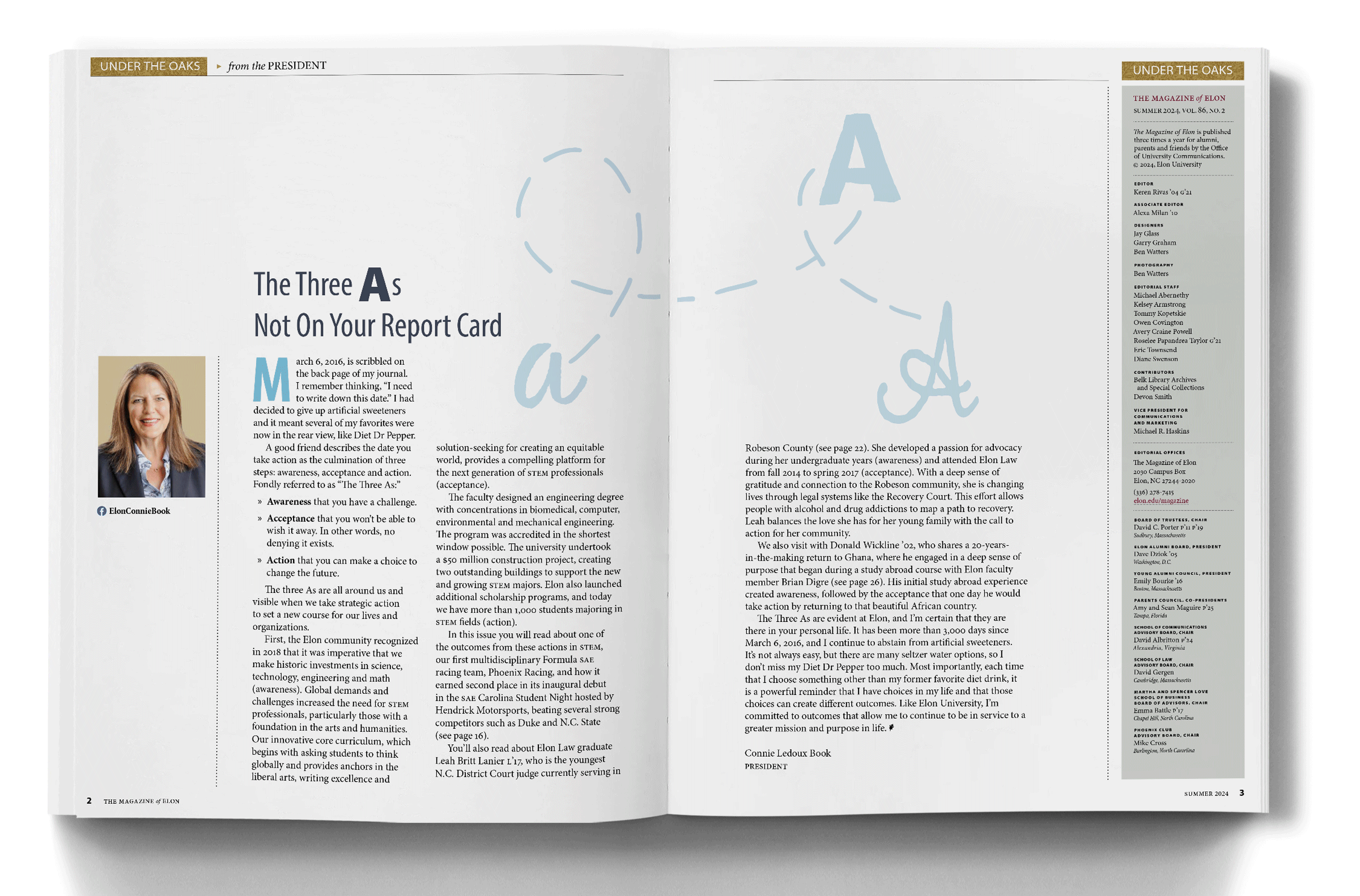
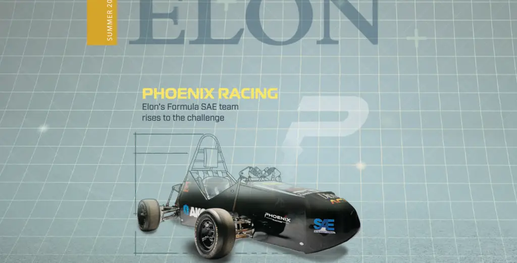
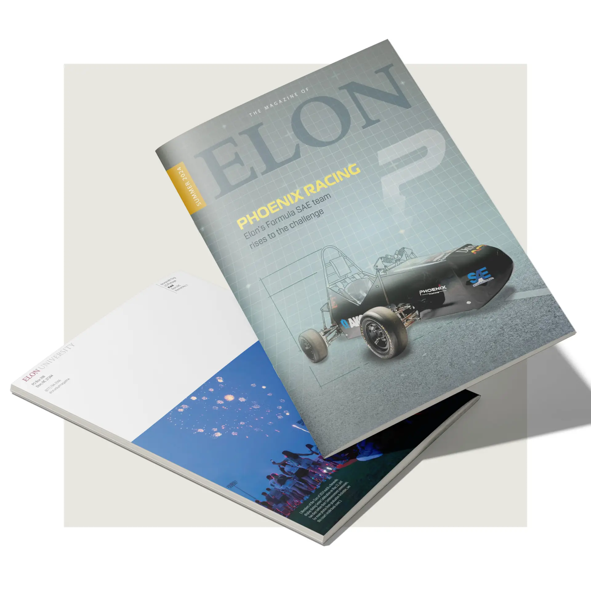
Elon Magazine
Designing and layout quarterly magazine for Elon University. 2024
Proposition:
Designing and laying out, in collaboration with the University Communications writing and design team, Elon University’s quarterly magazine.
Plan:
Create intuitive and visually engaging designs promoting the University’s initiatives and upcoming events while upholding the magazine’s existing brand and style system.
The Particulars:
I developed a new grid and template system in Adobe InDesign, which ensured design consistency while also identifying areas for improvement. The template system retains the essence of Elon Magazine’s established design while enhancing its functionality and flexibility, as the structure streamlines the layout process. This provides a cohesive visual identity across all editions while allowing space for creative storytelling and dynamic visual presentations.
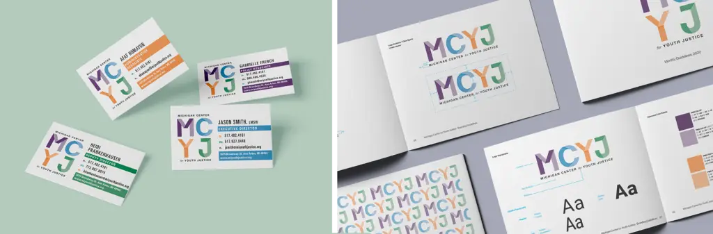
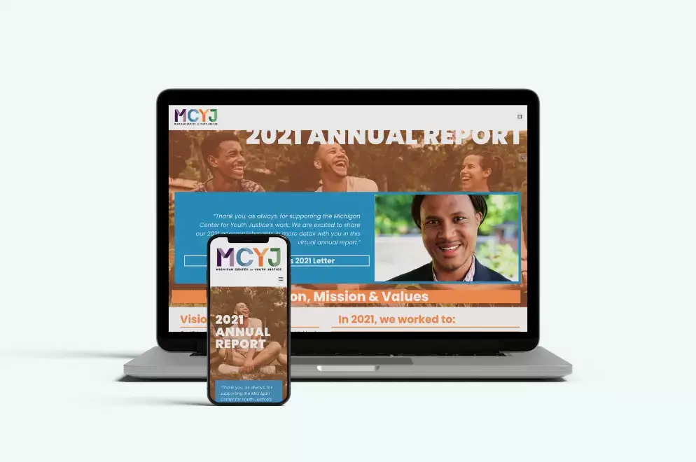
Michigan Center for Youth Justice
Brand identity and management for the Michigan Center for Youth Justice 2019
Proposition:
Design a visual Identity rebrand for the Michigan Center on Youth Justice (MCYJ), formally known as the Michigan Council on Crime and Delinquency (MCCD)
Plan:
Reinvent the MCCD brand from scratch, trading out the stark visuals often utilized in criminal justice campaigns for a visual identity that projects a message of hope befitting an organization focused on youth.
The Particulars:
After interviewing the MCYJ staff, I selected a palette of primary-leaning colors that captured the organization’s youthful focus. Looking for a way to maintain this bright, hopeful energy without losing the weight of MCYJ’s mission and vision, I took inspiration from origami, an art long associated with hope in the face of dire circumstances.
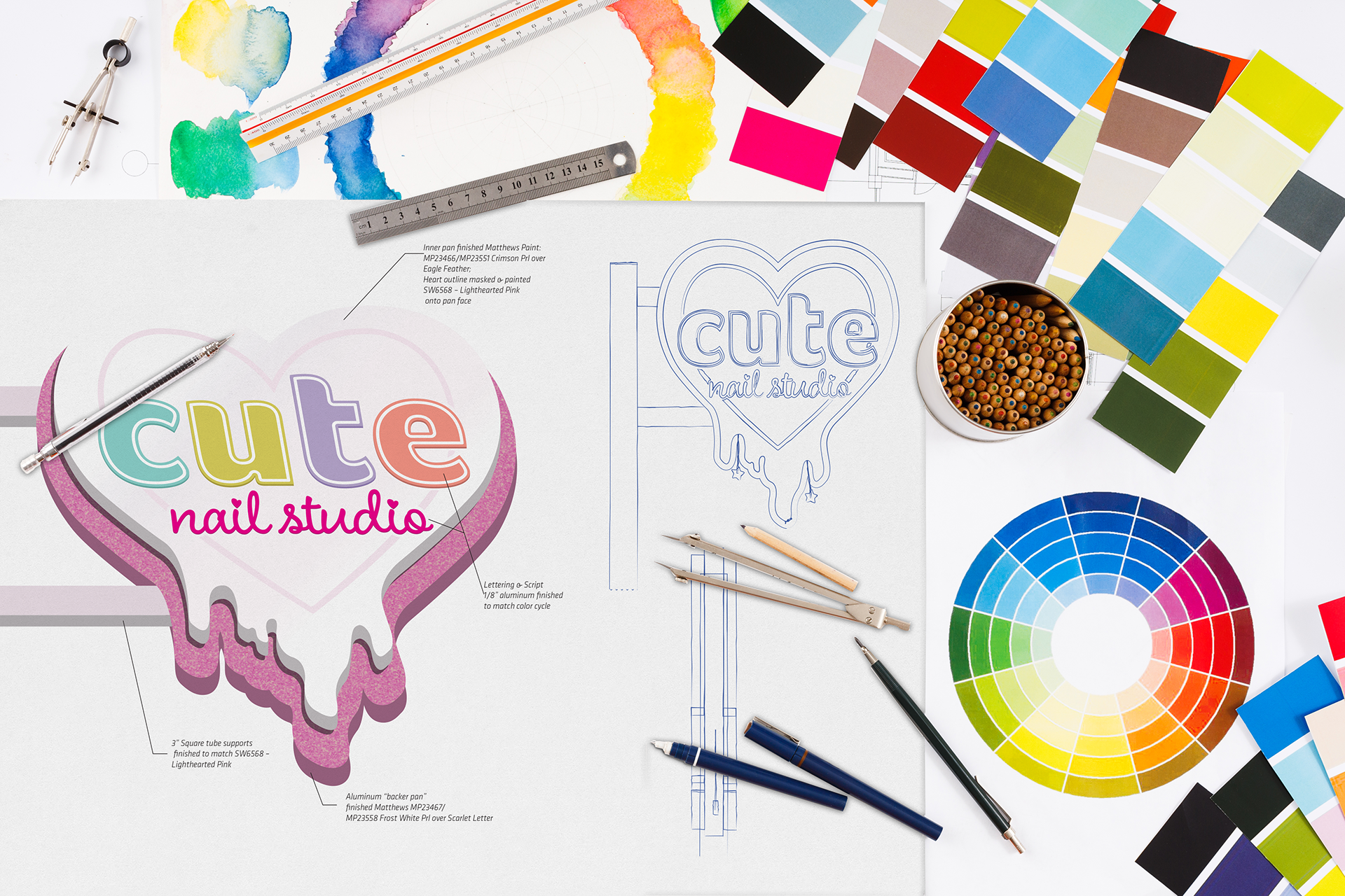
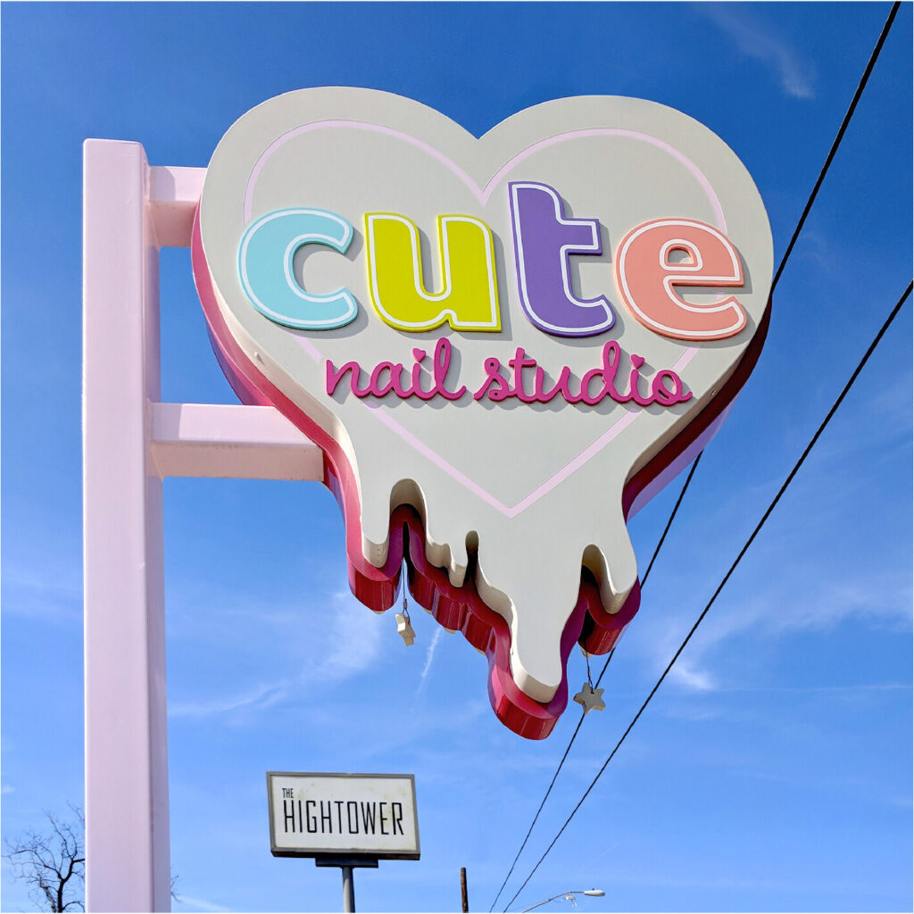
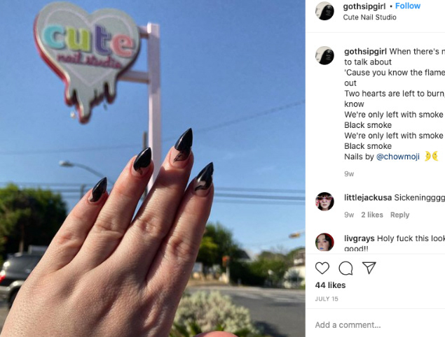
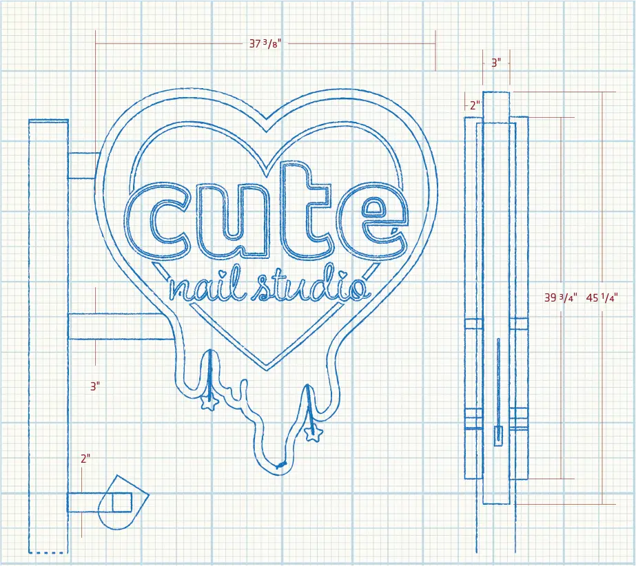
Cute Nail Studio
Double sided pole sign for Cute Nail Studio. 2017
Proposition:
Design a double-sided pole-mounted sign with an eye-catching maximalist aesthetic for Cute Nail Studio, a boutique salon in Austin, TX.
Plan:
Adapt Cute’s logo into a dimensional sign that stands out against a colorful storefront in a visually eclectic neighborhood.
The Particulars:
To create the sign cabinet, I adjusted the logo, exaggerating the drips and tweaking the proportions to ensure that everything looked good flipped- a necessity for a double-sided sign.
To balance the heavy square tubing our engineer called for, I developed three-inch deep tiers in the cabinet, giving the logo more depth without increasing cost or weight.
The sign was originally intended to be neon. When a last-minute construction change left us without power going to the sign, I instead used high-grade automotive finishes embedded with prismatic glitter chunks, popularized on race cars for their ability to sparkle and shine in natural light- a fitting compliment to the show-stopping gel and lacquer designs Cute specializes in.


